
The objective of this interior design project was to create a space that is vibrant, colourful, and exudes positivity, as shared by the client. Hence, by incorporating solid forms, clean geometry, and a harmonious conceptualization, the design reflects on Mondrian’s belief in the underlying mathematical structure of everything.
The Mondrian method
The main inspiration for the development of this project was drawn from the renowned artist Piet Mondrian’s artwork. His notable use of flat planes of colour, bold horizontal and vertical lines, and deliberate reduction to essential forms and colours greatly influenced the design direction. The objective was to create a space that truly encapsulates Mondrian’s abstract nature while evoking a profound sense of creative thinking and harmony.
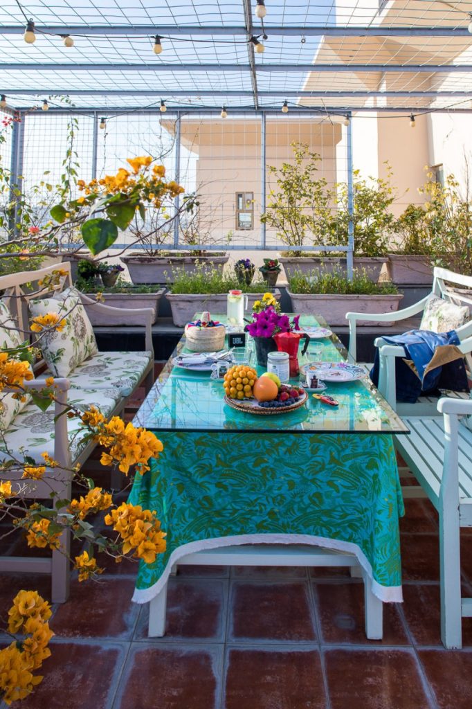
The design approach for this project was centred around the client’s desire for a vibrant and positive ambiance. To achieve this, the use of vibrant colours was essential, as they have a profound impact on our emotions and can uplift the overall mood of a space.
The selected design style wholeheartedly embraces the concept of pure abstraction. This means that it veers away from any direct representation of recognizable objects or subjects and instead focuses on the use of form, colour, and line as the primary means of artistic expression.
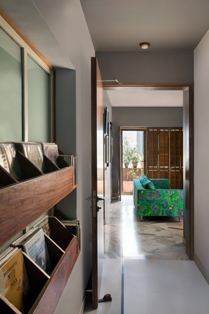
To achieve the desired aesthetic, various key concepts were employed throughout the project. The selection of materials played a crucial role in recreating Mondrian’s signature style. Wood, paint, and wallpaper were carefully chosen to create flat planes of colour and strong lines reminiscent of the artist’s artwork. These materials were strategically incorporated to emphasise the geometric elements and provide visual impact.
An ode to art
The spatial configuration was meticulously planned and executed to ensure a cohesive and impactful representation of the chosen design style. It was successfully delivered with the desired atmosphere by considering factors such as furniture arrangement, layout, and the integration of colour, all with the aim of evoking a sense of creative thinking and embodying the abstract nature of Piet Mondrian’s art.
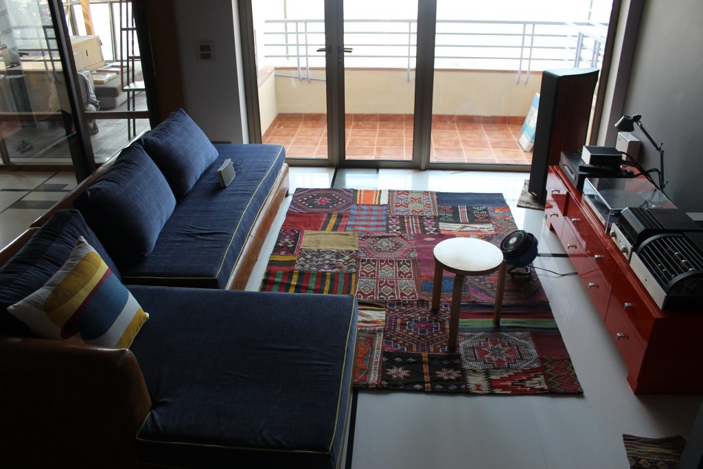
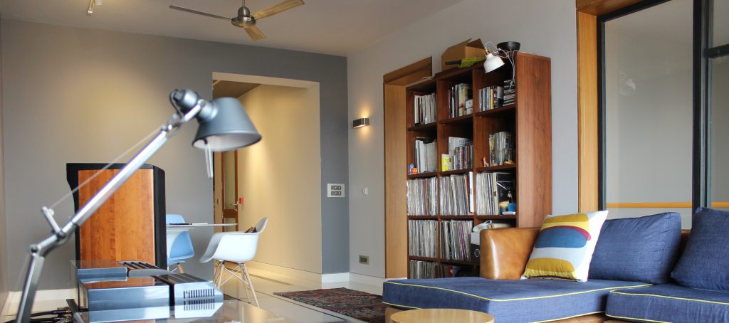
The arrangement of furniture and fixtures followed a deliberate approach that emphasised clean lines and geometric shapes. The placement of objects was intended to mirror the composition found in Mondrian’s art, with an emphasis on strong horizontal and vertical lines. The overall layout of the space was designed to create a sense of balance and order. The placement of elements aimed to establish rhythm and harmony, reminiscent of the repetitive patterns found in Mondrian’s work.
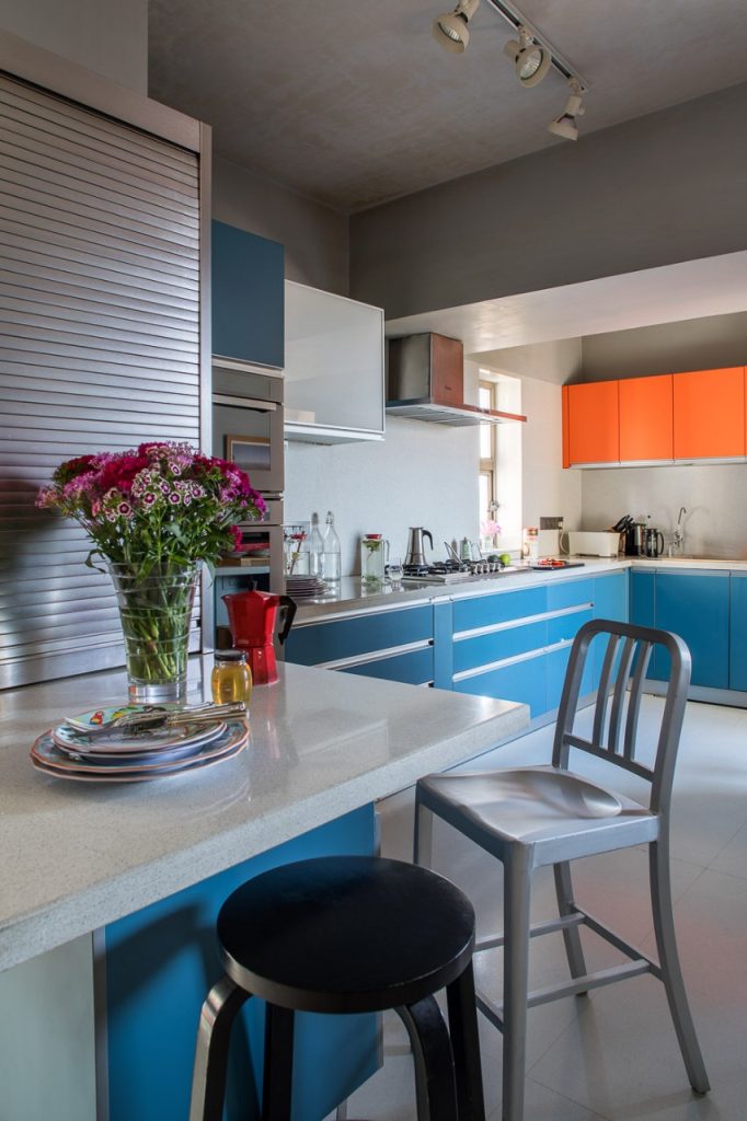
The use of colour played a significant role in the spatial configuration. Just as Mondrian utilised primary colours in his artwork, the project incorporated these vibrant hues strategically throughout the space.
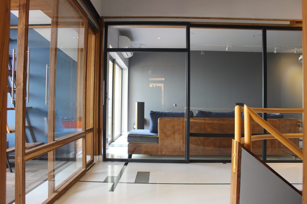
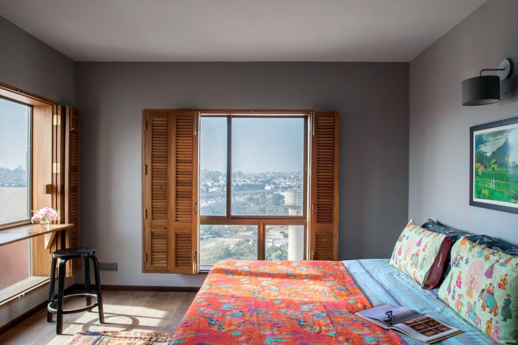
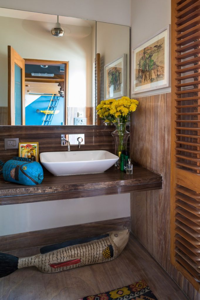
As for the principle materials, wood, paint, wallpaper, glass, and flooring materials were employed to create the desired visual impact and align with Mondrian’s style. Wood was utilised for furniture, wall panelling, and architectural features, enhancing the warmth and texture of the space. Paint was crucial in achieving the vibrant primary colours and flat planes of colour synonymous with Mondrian’s artwork. Wallpaper with bold geometric patterns added texture and visual interest to the walls. Glass introduced transparency and reflectivity, contributing to a contemporary feel. Flooring materials, such as tiles, laminate, or hardwood, often incorporated geometric patterns or colour blocking to complement the overall design concept. The furniture choices were carefully made to complement the design concept, emphasising simplicity, clean lines, and functionality. The selection of furniture aimed to create a harmonious blend of form and function, ensuring they enhanced the overall aesthetic while providing comfort and practicality.
Abstracting the palette
Colour played a crucial role in creating a dynamic and visually captivating atmosphere. The colour scheme focused on primary colours, such as vibrant reds, blues, and yellows, which are synonymous with Mondrian’s artwork. These bold and saturated hues were strategically employed to create contrast and draw attention to specific areas or elements within the space. The juxtaposition of primary colours against black and white created a sense of vibrancy and energy. Furthermore, the colour-blocking technique was used to create flat planes of colour, which mirrored Mondrian’s abstract compositions, geometric forms and lines, reminiscent of Mondrian’s artwork, were integrated into architectural elements, furniture, and decorative accents. These details enhanced the abstract nature of the design, creating a cohesive and harmonious visual language.
The concept behind the design was to maintain a consistent flow throughout the space, creating a harmonious and balanced environment. The use of solid forms and geometric elements, reminiscent of Mondrian’s paintings, represents the artist’s belief in the presence of a mathematical structure underlying everything, which has also been its USP. The well-planned spaces encourage creative thinking and ample natural light, providing a spacious atmosphere that accommodates daily activities. Incorporating a touch of Mondrian’s style adds a timeless appeal to the overall aesthetic.
The use of abstraction allows for a departure from literal representation, inviting viewers to interpret and engage with the design in their own unique ways. The geometric elements provide a sense of order and structure, while also creating visually appealing compositions that catch the eye. The use of abstraction allows for a departure from literal representation, inviting viewers to interpret and engage with the design in their own unique ways. The geometric elements provide a sense of order and structure, while also creating visually appealing compositions that catch the eye. Overall, the ability of the design to evoke a sense of creativity and inspiration stands out as a noteworthy element. It showcases the transformative power of design to stimulate the mind, ignite imagination, and create a memorable experience for those who interact with the space.
An important feature worth emphasising is the design’s capacity to create a visually invigorating atmosphere that stimulates innovative thinking and engages the senses. The project’s distinctiveness lies in its seamless integration of art and functional space, offering an immersive and visually captivating experience that sets it apart.
The project’s ability to evoke a sense of creativity and inspiration, with the combination of abstraction, geometry, and bold colours creates a visually stimulating environment that encourages creative thinking and engages the senses.
Fact file:
Name of the project: An Ode to Piet Mondrian
Location: Central Park, Gurugram
Total area: 4,200 sq ft
Type: Residential
Design firm: Uniifyy
Lead Designer: Ar. Ashish Batra
Photography Credits: Ar. Kavita Batra
About the design firm:

Uniifyy by Ar. Ashish Batra and Ar. Kavita Batra embodies the concept of perfect unity and synchronization among nature, clients, teams, and every individual involved. It upholds principles of harmony, simplicity, usefulness, and elegance, connecting people to nature from small spaces to entire cities. The foundation of Uniifyy lies in the belief that the Five Elements (earth, water, fire, air, and space) are fundamental to the universe and architecture.